As online shopping continues to rise in popularity, especially following the great quarantine of 2020, ensuring your e-commerce site is polished and optimised for your customers is highly important. If you’re like me, the hunt when you're looking for what to buy online is always a thrilling experience - from looking at the product benefits to seeing what others think of the product. But after that, it’s time for the dreaded stage - the checkout.
At that stage, I bet you can agree that you’re always feeling some form of discomfort. Is it the agony of having to type your extremely long address? What about the tantrum caused by a frankly ridiculous and totally unexpected $7.99 for shipping? How about the feeling of suspicion that you’re about to be scammed?
If you’ve felt these sentiments as you shopped online, then you have been subjected to poor user experience during checkout. The checkout process is the bridge between your website’s leads to those who convert, so having this pipe streamlined and polished ensures that you’re minimising abandoned shopping carts.
Let’s start with the basics…
What is the checkout process?
As simple as its name, the checkout process in eCommerce is the experience in which you take your customers as they check out an item from your website. The process usually happens in these 7 steps, as the customer:
- Adds the item to cart
- Reviews the cart
- Enters personal and shipping info
- Enters payment info
- Reviews the order
- Places the order
- Receives order confirmation
Pretty straightforward right!? As you build your website, knowing this tried and true process helps you understand where you know the customer is in the conversion pipeline and will aid you in tweaking your strategy, should any issues arise.
Why is it important to have an optimised checkout process?
Because we live in a time-poor society where we crave instant gratification, having an efficient checkout process helps your customers get in and out and get what they need, when they need it. Ensuring that your checkout process is polished and free of any annoyances is a great way to leave a positive experience in your customers’ minds. And of course, you know what a positive customer experience can bring, right? Repeat customers and positive word of mouth!
Now that we've run through the What and Why's, below are 11 best practices for an effective and efficient checkout process to get you closer to those oh-so-sweet conversions.
Ensure your checkout is mobile friendly
As the first point in this list, this ranks pretty high up there as one of the deterrents I’ve experienced as I’m about to checkout. With mobile eCommerce projected to reach $3.56 TRILLION in sales in 2021, more and more people are buying things online with their digital wallets and other online payment methods.
Luckily, all modern eCommerce platforms have their built-in check out pages optimized for mobile. However, when developing your own layout and integrating with call-to-actions, ensure that the design you have is responsive and is designed to be growth driven. Pushing this to the side would certainly mean losing a huge chunk of your sales and no business wants that.
Have the option for guest checkout
Forcing your customers to provide info they’re not ready to share with you is a suuuper sweet way to get them coming back. (If you cant detect the sarcasm out of that then I’m not sure what to tell you.) Guest checkout is the perfect solution to those customers who aren’t ready to commit to your business with their personal deets. Whatever the reason may be, having this option instead of pressuring them to sign up or login takes the pain out of the 2 step-authentications and forgotten passwords. By giving your customers the option to do what they want, it allows them to feel valued and respected meaning they’ll be more than likely to push through with the purchase.
If they have signed up, let them save personal information
This point comes as an alternative tip from the previous one. Every person signing up for an account with your brand is always something to value. As they sign up, they're pretty much indicating their interest to keep in touch with your brand, converting them into a qualified lead. Make your valued patrons’ lives easier by allowing them to save their info during the checkout. This way, they can check out in a breeze, taking the pain out of physically typing -- a real-life hassle in this modern world.
Include an option for social sign in
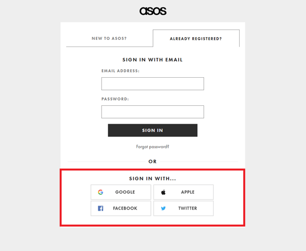
Many big-name eCommerce checkout pages utilise this and as a consumer, I cannot appreciate this feature enough, because its saved me so much effort. Much like the convenience of being able to save your personal details during checkout, social sign-ins saves customers steps in registering for an account. This feature allows your customers to link pre-existing social media accounts as a means of signing up for your business. Social accounts available for social sign-on include Google, Facebook, Apple, and LinkedIn.
Offer multiple payment options
Have you ever felt so ready to buy an item but only to be let down when the checkout page doesn’t have your preferred online payment method? Be it Paypal, Apple or Android pay or Google pay. With so many available payment options for eCommerce, ensuring you have options on your checkout page ensures your customer has the freedom to pay however they want. However, do keep in mind that having more offerings can cost your business, so ensure you have the major payment systems used in your local or global target market.
Show additional costs and fees
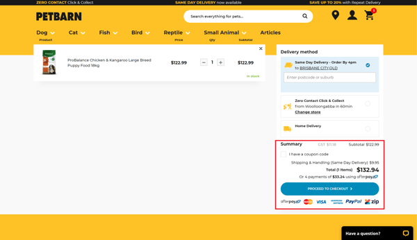
The shock of seeing an extra $10.99 for standard shipping can sometimes be enough for a customer to dip out the checkout process. By clearly showing any additional fees your products may have that’s not included in its price puts you in the right direction to a frictionless eCommerce checkout process. Your customers will want to know costs ahead of time, so be sure this can be easily seen in the shopping cart before they finalise.
Include a checkout progress bar
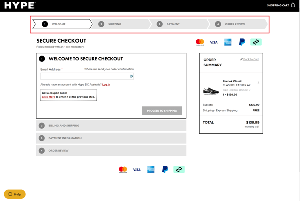
Leaving your customers in the dark especially when they’re about to hand over their hard-money is a big no-no in any context of a business and this especially rings true to eCommerce. Having a progress bar in your checkout pages lets customers track where they are as well as see what steps are ahead and review ones they’ve completed.
Have help information readily available
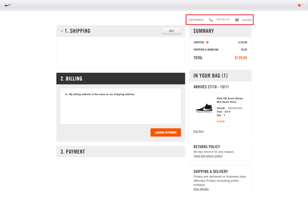
Stemming from the previous point, displaying customer service information in the checkout pages is a great way to build relationships with your customers and flex that awesome customer service. So, include a phone number, email address, or a live chat so customers can have access to assistance in order to minimise abandoned carts.
Provide a sense of security
According to ACCC’s (Australian Competition and Consumer Commission) ScamWatch, in August 2020 alone there have been 1 443 reported cases of eCommerce fraud, with a loss amount totaling around A$1 420 122. Yep it reached the MILLIONS. With this statistic, it doesn’t come as a surprise that many online shoppers are extremely wary of who they give their personal and financial information to. So, instilling trust in your customers can make or break of getting them through the checkout process.
One way to achieve this is by having an SSL certificate for your entire online shop if you don’t already have it. Essentially, the SSL certificate is the shiny badge that tells your browser that your website is coming from a secure and legit connection. Without this, the browser identifies the website as a potential security risk and warns the web visitor to stay away.
Another way to reassure your customer’s concerns is to display an official badge of a secure third-party software your business is partnered with. Think of it as a stamp of approval, telling customers that their backs are covered, should the whole transaction go sour. By having points of trust, your customers’ can attach to helps dissolve the barrier of trust between you (the merchant) and the buyers.
Allow customers to review their order before placing it
Having this as the last step before customers convert is another way to communicate transparency with the transaction. Because they’re essentially not seeing the physical product for another 24 hours or up to 2 weeks, letting them know of all the transaction’s details from top to bottom is a respectful way of saying “Are you really sure?” before finalising. Best chances are, they won’t delete everything from their cart after spending all that time searching, deciding, and typing, so this will reduce the pain points of having to return items and customer service attention.
Shoot a post-payment order email confirmation
Now that a customer has converted, its time to nurture the relationship.
Follow up with an email about their transaction, including all the details such as the item, item variant, price, taxes, and other relevant information regarding the shipping such as links for tracking and estimated delivery dates. Enacting on this soon after the transaction ensures that the customer is still cared for and removes the unwanted feeling of uncertainty whether their product will ever arrive. Doing so leaves a good impression of the brand as great customer service solves your customer’s problems by putting yourself in their shoes.
Final words...
As an eCommerce website, your checkout page hosts people who have already signaled that what you’re offering is what they want. It is a fact that in small to medium businesses, getting your casual visitors into the buying stage is no small feat. Now, all you need to do is to close the deal by streamlining your checkout process to allow for a smooth and painless process from the add to cart to the thank you email. While these best practices guide you to an efficient checkout process, every business is unique - meaning what works for some may not work for others. So, take the time to listen to your customers as nothing beats first-hand insight from the people you’re serving.

