Imagine a world without creative design. What comes to mind? The gift of the gab? Word-of-mouth? A stale sales pitch? Let’s face it, creating a brand and brand awareness solely around word-of-mouth or sales pitches to influence choices, would be pretty damn hard. It’s also boring.
Like hands to a glove, collateral and marketing go hand in hand.
I mean there’s a reason we can instantly recognise when something is Apple, before even seeing the logo. Not only does collateral design make something look good but it also holds the power to influence a brand message, while evoking certain feelings amongst a target audience.
Collateral makes marketing interesting and memorable. Things that stand out get remembered; a bull in a china shop, a fish out of water, or the time you wore a leopard print button up to Nancy’s black tie wedding. In the design world, this is called the Von Restorff Effect. When you’re memorable, it boosts your chances of customers choosing to buy from you over your competitors.
This blog will delve into the ins and outs of collateral design best practices, to make sure your marketing and branding messaging, is the best it can be (and maybe even more memorable than your outfit choice at Nancy’s wedding.)
What is marketing collateral?
Sure, capturing attention is part of the battle, but what happens when a prospect visits your website and sees nothing but some product descriptions and a pricing page? There has to be more there! This certainly ain't a 'fake it till ya make it' type situation. You need to have some kind of material to show you can do more than just talk the talk. That’s where marketing collateral comes in; and it can come in a variety of shapes and sizes.
Marketing collateral is all about how marketers use their assets to communicate brand value to their customers. The aim of collateral is to improve the experience of your interactions with your audience and is designed to help guide your target audience through the buyer’s journey. At its core, it should be a way for companies to let prospects know that you know what you’re talking about.
Anything that is used to promote and communicate a company’s products or services is known as collateral. When we say collateral, we don't mean a flashy advertisement like the ad Pepsi did with Kendall Jenner... Traditionally, collateral marketing consisted of mediums such as word of mouth and printed materials only. But the time’s are a changin’. In fact, they changed a bloody long time ago. Digital media opened the door to the masses, both with the promotional opportunities and the reach these opportunities provided businesses. Today, marketing collateral is anything from digital reports to blog posts, emails, eBooks, infographics and more.
The best part about digital media is that it is constantly evolving, allowing marketers to get creative, and use a diverse range of collateral to help communicate their message in a way that makes sense to them. The tough part? Choosing which type of collateral is best for your business.
So what type of collateral should you use?
Deciding what type of collateral to use will depend on your organisation and branding style. It’s also important that the collateral you use, has been carefully curated with your customers in mind - not created just for the sake of it. When prospects are deciding to buy, they are considering your company as a whole, not just what’s for sale. Creating thoughtful marketing collateral is one way to help that cause. Especially when the collateral is created for the different stages of the buyer’s journey. Why?
The buyer's journey is a lil' bit spesh. It will help you attract, engage and delight your customers, by meeting them where they are and providing the needed guidance and value they're seeking and at the right time. A bit like a true BFF who drives all the way to see you just to give you the right advice, when you need to hear it.
So what marketing collateral should you be using for each stage of the buyer’s journey?
Awareness Stage:
This is the point that your prospect is experiencing and expressing symptoms of a problem or opportunity. They're beginning their research in an attempt to decide whether or not the goal or challenge should be a priority. They want to be educated on what it is they are experiencing which can be delivered in the following forms of collateral:
- eBooks
- Blog posts
- Pillar pages
- Landing pages
- Infographics
- Branded content
Consideration Stage:
During the consideration stage, buyers have clearly identified the goal or challenge and are committed to addressing it. In doing so, they evaluate the different methods and approaches that are available to them to help them solve their challenge or pursue their goal. Collateral for the consideration stage include:
- Case studies
- Brand stories
- White papers
- Corporate brochures
- Product catalogues
Decision Stage:
Finally, in the decision stage, buyers have decided on their solution strategy, method or approach. Some example collateral for the final stage of the buyers journey include:
- Proposals
- Presentations
- Re-engagement emails
- Testimonials
What is brand collateral design?
As you might have guessed, brand collateral is design material used to provide information about your business or organisation - generally anything bearing the company logo. You want your collateral design to leave a lasting impression to your customers, but to also remain consistent. Kind of how you can identify MacDonald's instantaneously - you want to aspire to that level of brand recognition through everything you communicate to your customers. It'll help you establish a memorable, cohesive, and consistent visual brand.
Typical examples of collateral design include business cards, brochures, packaging designs, billboards and posters, sell sheets and catalogues.
How can design elements increase marketing collateral in digital marketing?
But how do you get to a MacDonald's or Apple type of brand recognition?
Design isn’t just about pretty pictures. Design psychology is big business. Every colour, typeface, and graphic represents your brand. Choosing designs that communicate to your audience is essential for attracting new customers and maintaining brand loyalty long-term. Design elements inform messaging in some really interesting ways.
Let’s take a look:
Colour
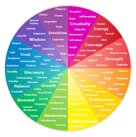
Colours are associated with emotions and different colours evoke different moods. . Different colours evoke different moods. Blue is generally considered calm, whilst red invoked intensity. Green speaks of nature, whereas black confers sophistication, power and authority.
Throwing it back to primary school where we learnt about colour wheels - we also learnt that colour and emotions are linked. It's only now that we're older, we realise this is a scientific fact. Appropriately titled Colour Psychology, it entails that specific colours evoke emotions to viewers. Cool colours like purple have been found to stimulate the brain into being creative while warm colours like yellow and orange reveal to arouse appetite.
With so many colours to utilise, each with a different emotion to stimulate, using the right colour palette for your graphics and prints can indicate to your customers how they should feel about your brand. Use the colour psychology wheel below to help you guide what emotions you’d want your audience to feel as part of your inbound marketing campaign.

Shape
Did you know that people connect shapes with characteristics. I didn't either - but it's also scientifically proven. Accordingly, circular shapes are associated with unity, whilst more angular shapes evoke stability and professionalism. Diagonals are all about speed and progression, whilst verticals perpetuate aggression.
You really do learn something new every day.
Dual-Coding
Some strategists use dual-coding theory to support their marketing collateral design services. Dual-coding theory says that visual and verbal representations, together, help the brain recall ideas much faster. In other words, designs that use images and language should make the best collateral.
Collateral design best-practices
You get it. Collateral design is an essential element to your marketing toolkit for keeping our customers engaged and interested. So, how can we deploy successful design collateral to keep our brands fresh and competitive? Follow these collateral design best-practices and you'll be on your way to communicating value with your customers more effectively.
- Have a clear goal: When planning your design collateral be clear about its purpose, audience, key content, and location.
- Keep things simple: Great design isn’t complicated. Simple layouts that break up text with informative visuals are the best way to go.
- Be visual: Include high-quality images to help your products and services stand out.
- Get creative: Simple doesn’t mean boring. Experiment with colour, shape and texture.
- Bridge the gap: Make sure your digital and print collateral share a common message.
Start standing out today
Clever collateral design will help you stand out from the crowd. All businesses need a strong brand identity. Design is key to first impressions and customer loyalty. Collateral comes in all sorts of shapes and sizes, but the design of your collateral is essential for businesses that want to deploy meaningful connections with their consumers.
Design psychology goes to show that colour, shape, and texture, impact the way people engage with a product or service. By choosing wisely, you’ll be sure to produce marketing materials that are both attractive and lucrative. Remember, the best design collateral is to keep simple...but strategic.


