Any inbound-lingual marketer has been programmed with the knowledge that landing pages are the most indispensable way to convert your website visitors into leads. Despite this, we often forget to ask the right questions and do the right research to ensure those landing pages are appealing enough to be even classified as a lead magnet. In fact, many of us actually just assume we know what's best. Rookie error.
A wise man once said “When you assume, you make an ASS out of U and ME”. Word up - couldn't have said it better if I tried.
Let's face it though - it’s easy to make assumptions. All you need is incomplete information about a situation and an unwillingness to learn more.
This laziness can mean that when we go to create landing pages, we essentially connect the dots blindfolded, ending up with a traumatic mix of colours, aggressive use of comic sans, and modules coming out the wazoo. While you might think that your landing page is extra funky and makes an impact, your audience might think the only real impact is on their poor retinas.
This is where A/B testing comes in - a sure-fire way to put the foot down on your landing page creation and ensure that what you're creating isn't just great for your artistic expression, but also great for lead generation!
What is A/B testing?
Just like a childhood game of Chinese Whispers, the definition of A/B Testing has been somewhat mangled as people confuse it with similar tests like Split Testing - so let's cut right to the chase. A/B Testing refers to the comparison of two versions of the same piece of content, with one item changed on the variation. For instance, you might create a variation of an existing landing page and tweak the headline, or change the colour of the CTA. During the test, you'll be able to see which version generated more engagement, including click-throughs and conversions and adjust your strategy.
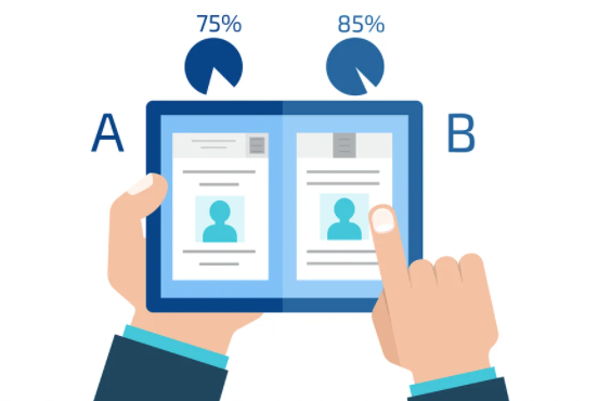
Intuition and consumers' somewhat inconclusive reliance on a 'hunch' is one of the most powerful forces driving a customer to buy. The gut feeling a person gets about your business will be a major determinant of whether or not they choose to convert. For this reason, we need to create an interface that establishes trust, knock over any roadblocks that may stand in the way and hack into the minds of our customers to find out what makes them tick!
Now that we know a little bit more about the 'why' of A/B Testing, as mentioned - there are several key parts to put it into play. Let's go through each of the ways you can change up your landing pages for maximum engagement and conversion potential!
1. Landing Page A/B Testing of the CTA Button
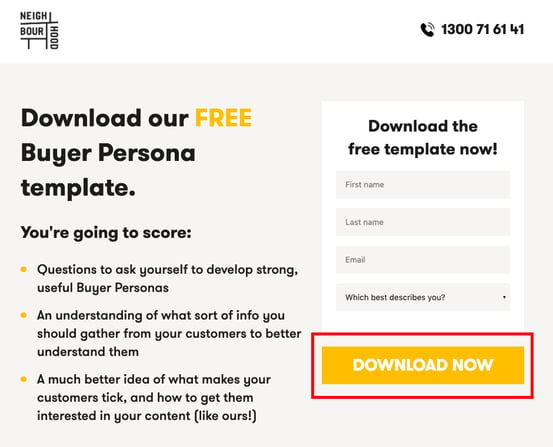
The success of your CTA often comes down to your turn of phrase, where you position it and even the colour choice. In regard to the phrasing, you'll want to look into how exactly you want your leads to interpret your words, because you can actually say a lot without realising. For example - you could say "Download the eBook", or change it up to say "Download MY eBook". One of these phrases will actually deliver far greater results - so be sure to keep testing to find the perfect option! Ensure that when you're carrying out this testing, that the messaging and wording is descriptive enough and the message is clear so people know full-well what to expect!
Not only is the copy super important, the placement of the CTA plays a much larger role than you might think. It has been gospel for a while now to place your CTA above the fold (the part of the page you can see without scrolling down), but depending on the complexity of your offering, you might want to shake up your strategy. Understanding that your leads need to get a good grasp on your product offering before feeling comfortable enough to click on a CTA, you may want to give them this opportunity by placing your CTA lower on the page. You don't want to spook them with a CTA before they know what they're in for.
The last component of your CTA that you can A/B test is the design. Changing the design is possibly the fastest and easiest way to test the website visitor response quickly, and establish somewhat of a rainbow connection. Have a look at which colours match your branding and which your ideal buyer responds to the most. Is there a colour your male buyers prefer? There is plenty of research out there about CTA psychology, and how certain colours elicit certain emotions - for example, Orange has been found to be more attention-grabbing and evoke feelings of excitement, enthusiasm and warmth.
2. Landing Page A/B Testing of the Headline
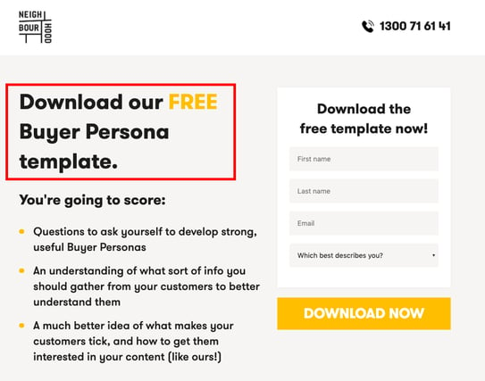
First impressions are a one-time thing. Unless you go full 'Eternal Sunshine of the Spotless Mind' on 'em, you've got to make it count. As with the copy of your CTA, the way you decide to phrase your headlines can make or break your landing pages.
Regardless of whether you believe your headline is strong and clear enough already, ensure you're getting the absolute most out of your landing page by putting your linguistic genius to the test. You don't necessarily have to overhaul the entire headline - you could even alter keywords or use related words instead. Remember - it's all about customer experience, so you have to make a considerable effort to focus on the preferences of your customer rather than your own. While you might think "Schedule your chat here" sounds too airy-fairy compared to "Schedule your strategy session here", your customers might be less intimidated and be more inclined to book a meeting with you. Always put yourself in the shoes of your customers!
3. Landing Page A/B Testing of the Images
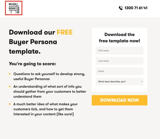
While your mum may have told you otherwise, aesthetics matter - in the world of landing pages anyway! The imagery you choose to select has to communicate that which your copy can't, and your chosen image may be pushing people away, so tread carefully!
Using an image just for the sake of it may actually be detrimental to your marketing efforts - so get testing! Ensure that you experiment with different images, or even video, and test whether your landing page even needs an image. The inclusion of imagery, or lack-thereof, has to be strategic!
4. Landing Page A/B Testing of the Copy
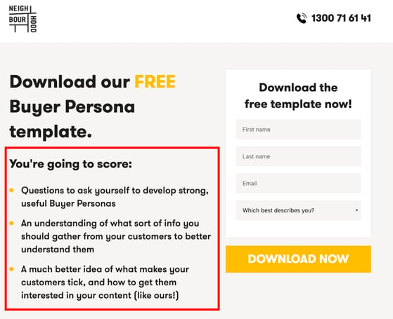
Your landing page copy has to play to the emotions, thoughts and feelings of your ideal customers. Write copy that will stop them in their tracks because it speaks to them. Say something meaningful every time - don't merely clunk up the copy with page-filler, provide written value. You could even include any glowing customer reviews you may have, to improve the trust you portray without having to say as much.
It's super important to remember that each component of your landing page works with one another to reach the desired action. Your body copy is complemented by the other parts that form the complete puzzle that is your landing page. For example, your headline - while small - is mighty. So if it's not performing, it won't even matter that you spent hours on the copy, because no one will hang around long enough to read it! Likewise, if your headline is great and your copy is masterfully crafted, but no one converts - the problem is in your CTA!
5. Landing Page A/B Testing of the Form
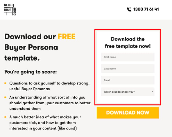
The form is the tickle in the sneeze of landing page lead generation - it's how you actually get them from point A to point B in your buyers journey. With it being so crucial to the efficacy of your landing page, you'd better get familiar with some best practices. First off - consider things like how many form fields you're using and what you should ask in those fields. While a name and an email address is great for a simple newsletter subscription, you should be collecting more info on some of your downloadable content offers. This is a trade of value - you're delivering value to the prospect, so in turn, you should be receiving value from your marketing efforts in the form of that all-important info!
Best Practices for A/B Testing Landing Pages
Now that you know what you can actually A/B Test, let's make sure you're doing the best job possible by running through some best practices!
1. Test a Single Variable
Ensure that at first, you make small, incremental changes to your landing page so that you can isolate the results from changing a particular component. If you're doing too many things at once, things can very quickly get confusing and you'll miss what made the positive impact.
2. Keep it Running
If you choose to remove an image as part of your landing page A/B Testing, ensure you're still running and testing against the original. That's the only way you'll be able to see a change!
3. Test at the Same Time
Testing different pages at different times won’t provide you with an accurate comparison of their efficacy. Hubspot will automatically split the traffic to each variation randomly to ensure the most valuable comparison information.
Reasons you should use A/B testing
By now, I'm sure you've gauged that A/B Testing is a pretty groovy way to go full 'Nick Marshall' on your prospects - you know just what to say! But that's not all A/B Testing is good for! Let's take a squizz at four more reasons you should be optimising your landing pages.
1. Higher Conversion Rates
As many marketers have come to realise, the cost of acquiring any quality traffic can be pretty huge. A/B Testing lets you make the most out of your existing traffic and helps you increase conversion without having to spend on acquiring new traffic. As well as this, A/B Testing can provide you with higher ROI, as sometimes even the most minor changes can result in a significant increase in conversion!
2. Reduce Bounce Rate
One of the most important ways to track whether your website is a go-er in the eyes of your customers is to track your bounce rate. There can be many reasons for your website bounce rate - don't write it off as being a personal dig - there might be too many options, an expectations mismatch, etc. As different websites serve different goals and cater to different audiences, there's no sure-fire way to fix a bounce rate. But A/B Testing is your best bet! Think about it - testing your website over and over to find the best possible landing page formula is guaranteed to improve your user experience, as well as increase the time visitors spend on your site and reduce those bounce rates!
3. Ease Visitors' Pain Points
Visitors come to your website to achieve a specific goal - it might be to understand more about your product or service, to learn more about a topic or to simply kill time. Whatever the goal may be, they may face some common pain points in trying to achieve that goal, be it confusing copy, a hidden CTA button, etc. Not being able to achieve their goals can seriously dampen the overall user experience, increase friction, and ultimately impact your conversion rates ... the solution? A/B Testing!
4. Increase Engagement
While I've made it pretty clear that landing pages are pretty much the be-all and end-all of conversion, we can cut our website visitors some slack every once in a while. Having a visitor hit your CTA is albeit a great feeling, but even if they don't - remember that your landing page also acts as a critical vehicle for spreading your message.
If your landing page 'speaks' to a visitor who isn't yet ready to convert or buy, they might instead decide to follow you on your socials or check out your blog. Just because that consumer doesn't buy right now doesn't mean they won't return later ... ever heard of 'right person, wrong time'?
A/B Testing your landing pages means that you can pinpoint the imagery and language that resonates wholly with your audience - and hey! The more precise you get, the more engagement you'll see across all the platforms you use to reach your audience!
And that's the short and long of it, folks! After reading this lil' intro to the world of A/B Testing, you should feel more than ready to flesh out an optimisation roadmap and start the trek towards testing each and every one of your landing pages to significantly improve your users' experience and birth the most squeaky clean version of your website. A/B test your landing pages today so you don't lose customers tomorrow!


